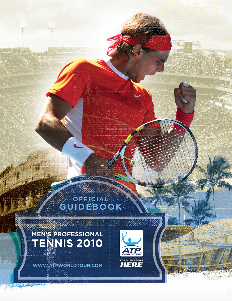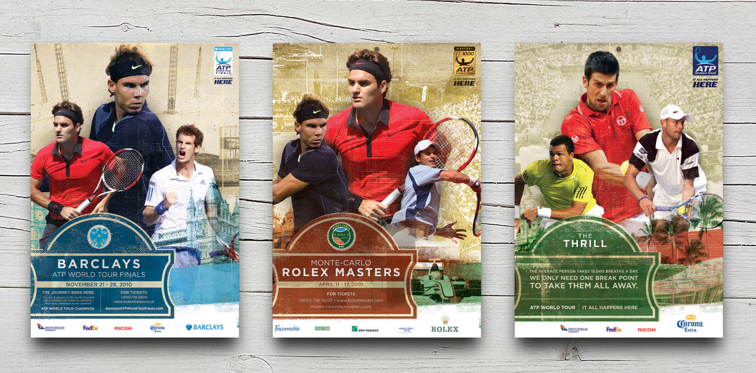

ASSOCIATION OF TENNIS PROFESSIONALS (ATP)
Designing a Versatile Visual Aesthetic for the ATP
The ATP Tour is the carrier of the games biggest stars and most dramatic stages. They asked us to pitch for their season-long marketing campaign, producing materials that every tour stop could choose to use to promote their tournament.
Research uncovered the design problem pretty quickly: some tour stops are at venues that are rustic, old, and nostalgic, while others are at venues that are new, slick and shiny. The marketing goal was clear: convince more venues to use ATP-branded marketing materials rather than creating their own. Our campaign strategy was to give each tour stop their own identity while retaining a consistent overall brand aesthetic. Backgrounds were built from city and stadium highlights, older venues carry a gritty, textured feel while newer venues felt new and shiny. Badge graphics keep the campaign in the same visual family and provide a familiar shape to the entire campaign.